Polarized Fractal Efficiency
In finance, one of the key tools gaining traction among analysts and traders alike is the Polarized Fractal Efficiency (PFE) indicator. Developed by Hans Hannula, this indicator has found its way into many financial models and is increasingly relied upon for stock price predictions and market trend analysis.
What are Fractals?
But before delving into the intricacies of the PFE indicator, it’s essential to grasp the concept of fractals. Fractals, as Mandelbrot elucidated, are mathematical patterns characterized by self-similarity. They reveal intricate structures that repeat themselves at different scales. This concept has found application in various fields, from describing natural phenomena to understanding market dynamics.
I have included the link to a Ted Talk by Mandelbrot at the end.
Fractals are mathematical patterns that are characterized by self-similarity. If a fractal pattern is zoomed into, the exact same pattern appears. Few popular examples are the Sierpinski Gasket and the Koch Snowflake.
Fractals exhibit a unique property where their dimension is not a whole number, but rather a fractional value. Mandelbrot’s exploration of fractal geometry began with a simple question: How long is the coastline of Britain? This led to the revelation that traditional measures of length fail to capture the complexity of irregular shapes, giving rise to the notion of fractal dimension.
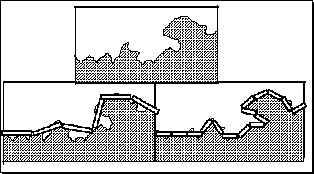
The coastline is irregular, so a measure with a straight ruler, as in the next figure, provides an estimate. The estimated length, L, equals the length of the ruler, s, multiplied by the N, the number of such rulers needed to cover the measured object. In the next figure we measure a part of the coastline twice, the ruler on the right is half that used on the left.

But the estimate on the right is longer. If the the scale on the left is one, we have six units, but halving the unit gives us 15 rulers (L=7.5), not 12 (L=6).
If we halved the scale again, we would get a similar result, a longer estimate of L. In general, as the ruler gets diminishingly small, the length gets infinitely large. The concept of length, begins to make little sense.
The relation between length estimate and length of scale is linear on a log-log plot. Mandelbrot assigned the term (1-D) to the slope, so the functions are:
\[\log[L(s)] = (1-D)\log(s) + b\]where D is the Fractal Dimension. For Great Britain coastline, approximately:
\[1 - D = -.24,\]So,
\[D = 1-(-.24) = 1.24,\]which is a fractional value.
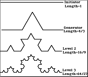
Let us now see an example on how to find the dimensions of a fractal: KochCurve. We begin with a straight line of length 1, called the initiator. We then remove the middle third of the line, and replace it with two lines that each have the same length (1/3) as the remaining lines on each side. This new form is called the generator, because it specifies a rule that is used to generate a new form. The rule says to take each line and replace it with four lines, each one-third the length of the original. We do this iteratively … without end.

The length of the curve increases with each iteration. It has infinite length.

But if we treat the Koch curve as we did the coastline, we find its fractal dimension to be 1.26. The same result obtained from:
\[D = \log(N)/\log(r) D = \log(4)/\log(3) = 1.26\]What is Polarised Fractal Efficiency?
The Polarized Fractal Efficiency indicator is, in the essence, an exponentially smoothed ratio of the length of two lines:
- A straight line between today’s close and the close period days ago, and
- A broken line connecting all Close points between today and period days ago.
At its core, PFE measures the efficiency of price movements over a specific period, shedding light on the underlying trends within a financial market. Unlike traditional metrics, PFE delves deeper, capturing not only the magnitude but also the directionality of price changes.
Furthermore, PFE operates on a polarised scale, illuminating both bullish and bearish sentiments within the market. This duality enables traders to decipher the underlying forces at play, empowering them to make informed decisions amidst the ever-changing landscape of financial markets.
The PFE generally indicates how trendy or overloaded a market is. In case the PFE reading is below zero, this suggests there is a bear trend. In case the PFE reading is above zero, this suggests there is a bull trend. The higher the value,the more efficient, ”trendier” the movement to the upside is. If the PFE reading is in proximity to zero, this means that market movement is choppy and lessefficient.
But the power of PFE extends beyond mere calculation; it serves as a harbinger of future market movements. Through its ability to forecast price trends with remarkable accuracy, PFE equips traders with a formidable tool for anticipating market shifts and seizing profitable opportunities.
Usually a trader will enter at maximum efficiency, a level where the PFE appears to have reached a maximum in one direction or the other. The trader needs to keep his/her position active all the way to the other extreme level.
However, as ever there are exceptions. When the PFE slows down at levels close to zero – he/she should exit the trade and wait for another entry at ”maximum efficiency” level. Stocks that have a PFE value greater than zero are deemed to be trending up, while a reading of less than zero indicates the trend is down. The strengh of thetrend is measured by the position of the PFE relative to the zero line.
Market Signals
The buy signal triggers when the indicator reverses direction, transitioning from its minimum to zero. To close the position, watch for the indicator to peak above zero. Conversely, a sell signal is generated when the indicator moves from its peak to zero. If holding a short position, consider covering it after the indicator forms a new minimum value.
As a general rule, the further the PFE value is away from zero, the stronger and more efficient the given trend is. A PFE value that fluctuates around the zero line could indicate that the supply and demand for the stock are in balance and price may trade sideways.
A simple way to read this indicator is that if it is >50 (<-50) then the market is likely to reverse its trend from positive to negative (from negative to positive).
Formula for Calculating Polarized Fractal Efficiency (PFE)
\[P_{i} = 100 * \frac{\sqrt{(Price_{i}-Price_{i-N})^2+N^2}}{ \sum_{j=0}^{N-2} \sqrt{(Price_{i-j}-Price_{i-j-1})^2+1}}\] \[if Close_{i} < Close_{i-1} , P = -P\] \[PFE_{i} = EMA(P_{i}, M)\]where:
- N = period of indicator.
- M = smoothing period.
Mandelbrot was a French and American mathematician who referred to himself as the “fractalist. He coined the word “Fractal” and is recognized for his contribution to fractal geometry.
Below is the Python code to calculate PFE.
import math
pfe_length = 10
pfe_period = pfe_length - 1
pfe_values = [0] * 9
for i in range(9, len(df)):
    diff = df['Close'][i] - df['Close'][i - pfe_period]
    pfe1 = 100 * math.sqrt(pow(diff, 2) + pow(pfe_period, 2))
    pfe2 = 0
    for j in range(0, pfe_period - 1):
        pfe2 += math.sqrt(1 + pow(df['Close'][i - j] - df['Close'][i - j - 1], 2))
    pfe = pfe1 / pfe2
    if diff < 0:
        pfe = -pfe
    pfe_values.append(pfe)
df['PFE'] = pfe_values
df['PFE'] = df['PFE'].ewm(span=5, adjust=False).mean()
Below is the Python code to generate and plot a Kock snowflake curve.
import matplotlib.pyplot as plt

def koch_snowflake(order, scale=10):
    """
    Generate a Koch snowflake curve with a given order and scale.
    """
    if order == 0:
        # Base case: a single line segment
        return [(0, 0), (scale, 0)]

    # Recursive case: get the points of the previous order
    points = koch_snowflake(order - 1, scale)
    new_points = []

    for p1, p2 in zip(points[:-1], points[1:]):
        # Calculate the new points in between
        x1, y1 = p1
        x2, y2 = p2
        dx = x2 - x1
        dy = y2 - y1

        # Calculate the 1/3 and 2/3 points
        p1 = (x1, y1)
        p2 = (x1 + dx / 3, y1 + dy / 3)
        p3 = (0.5 * (x1 + x2) - (3 ** 0.5 / 6) * (y1 - y2), 0.5 * (y1 + y2) + (3 ** 0.5 / 6) * (x1 - x2))
        p4 = (x1 + 2 * dx / 3, y1 + 2 * dy / 3)
        p5 = (x2, y2)

        # Add the new points
        new_points.extend([p1, p2, p3, p4, p5])

    return new_points

# Generate and plot the Koch snowflake curve
order = 5  # Change the order for more or less detail
scale = 100  # Adjust the scale as needed
snowflake_points = koch_snowflake(order, scale)
x, y = zip(*snowflake_points)
plt.figure(figsize=(8, 6))
plt.plot(x, y)
plt.title(f'Koch Snowflake Curve (Order {order})')
plt.axis('equal')
plt.axis('off')
plt.show()
References:
- Below is a TED talk by Benoit Mandelbrot on ”Fractals and the Art ofRoughness”. TED talk by Benoit Mandelbrot